Tuesday, December 9, 2008

Star Plot


This star plot allows you to look at information on different makes and models of vehicles made in 1979. As shown in the first plot (AMC Concord), there are nine different variables for this plot.

Stem and Leaf Plot

This stem and leaf plot shows the infant mortality rates is Western Africa. Each value shows the number of deaths per 1,000 births for each country.

Box Plot


Histogram

This histogram shows the heights of different students. As you can see the students range from 58 to 74 inches but have the highest frequency between 62 and 66 inches.

Parallel Coordinate Graph


Triangular plot


Windrose


Climograph


Population Profile


Scatterplot


Index Value Plot


Lorenz Curve


Bilateral Graph


Nominal Area Choropleth Map


Unstandardized Choropleth Map


Standardized Choropleth Map


Univariate Choropleth Map


Bivariate Choropleth Map


Unclassed Choropleth Map


Monday, December 8, 2008

Classed Choropleth Maps


Continuously Variable Proportional Circle Map


DOQQ


DEM


DLG


DRG

http://www.forestpal.com/images/drg.gif

Isopleth

http://nadp.sws.uiuc.edu/isopleths/maps2003/nh4.gif

Isopach


http://seeps.geol.ucsb.edu/images/pictures/geology_images/isopach.jpg

Isohyet


Isotach

http://reductionism.net.seanic.net/bgary.mtp2/dc951211/fig_04.jpg

Isobar


LIDAR


This image shows the site of the aftermath of the tragic event that took place on September 11, 2001. This image was created and used by the NOAA and the US Army Joint Precision Strike Demonstration to locate elevators, basements, foundations, and different heights of rubble within the site. The image helped in the clean up of this terrible attack on the World Trade Centers.

Doppler Radar

http://cache1.intelliweather.net/imagery/KSNW/rad_ks_wichita_640x480_01.jpg

Black and White Aerial Photo

http://www.nzetc.org/etexts/WH2-1RAF/WH2-1RAF014b.jpg

Infrared Aerial Photo

http://www.fas.org/irp/imint/docs/rst/Sect10/originals/Fig10_7.gif

Cartographic Animation


This is a cartographic animation of Hurricane Katrina making her way over New Orleans, Louisiana. This was recorded at 2:45pm on August 28, 2005. The illustration in the lower left hand corner states that this hurricane had the lowest SFC PRES ever recorded in this part of the gulf: the record was that of 902MB.

Statistical Map

This map demonstrates the crime rates in Denver, Colorado. It shows whether there was a decrease, increase, or no change between the 2001 and 2002. http://www.denvergov.org/Portals/335/images/SOPA_bur02.jpg

Cartogram

This cartogram represents electoral votes during the presidential election. It is distorted in shape and size of certain states to represent how much the value of each state's electoral vote is really worth.

Flow Map


This thematic map shows the different flows of lava on the island of Hawaii. The lines in this map show volcano boundaries and lava flow. This map also has a numerical scale from 9 to 1 showing the "increasing security of hazard."

Isoline Map

Isoline maps use lines to convey numerical values. This map is actually a temperature isoline map created by a combination of about 50 weather stations. 
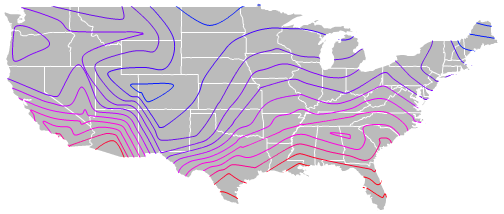
http://indiemaps.com/images/isolineFinished.png

Proportional Circle Map


Choropleth Map


This map shows the percentage of Latino or Hispanic originated persons of each county in Florida. Notice that southern Florida has a higher percentage of Hispanic and Latinos than northern Florida and the panhandle.

Dot Distribution Map


This type of thematic map shows the amount of breeding of a species of the dragon fly calld the Brown Hawker (Aeshna grandis). For both red and black, the larger the dot, the more proof that there is breeding in these areas. Each color represents a different time that breeding results were recorded. This map was created by David Kitching.

Propaganda Map


This propaganda map shows how the Nazis tried to make as many allies of its surrounding countries as possible. This was made to show Nazi efforts during World War II.

Hypsometric Map


This hypsometric map shows the reliefs all over Canada. Reliefs are measured in meters and different colors are used to show different levels of elevation.

PLSS map


This map is a small section from a PLSS map of Minnesota. The original map has a scale of 1:100,000 and breaks up different government regions by category and number, and range and town lines by the red lines.

Cadastral Map


This cadastral map was used in the 19th century. A series of numbers indicate housing areas, roads, parcels, and areas of water.

Thematic Map


This thematic map shows the median incomes for households across America. Different levels of wages are represented by several different shades of colors. Alaska, Hawaii, and some northeastern states have higher household incomes than most states in America.

Tuesday, December 2, 2008

Topographic Map


This map is a simple version of a topographic map consisting of ten different features. Theses features are numbered 1-10. For example, #1=hill, #2=valley, etc. Not only ar there contour lines for different levels of elevation, but other features are included such as streams running off from the hill. Though the streams are not a major (numbered) feature, they are still included on the map.

Planimetric Map


This map is a geological map of Alaska. The scale of the map is that of 1:250,000-scale quadrangles. William P. Brosge is the map-maker who took special consideration to the light-yellow portion of the map, which is concentrated on the Arctic and Christian quadrangles. http://www.diggles.com/wbrosge/map.gif

Mental Maps


This mental map is a map of the world from a child's mental image. It is not a detailed map, and certain areas are enlarged, but this image shows that children as well as adults have different ideas of how a map is created. Since the Northern areas of the map are enlarged, maybe that child is from that region and thinks of it as larger than it really is.